OUGD603: Brief 7 (Gordon Riggs Re-brand) Initial Research

For my fourth studio brief I am re-branding a garden centre in my hometown. Gordon Rigg's has become a well known garden centre attracting many visitors from across the pennines. The existing branding is very outdated and, due to the increase in visitors, would benefit from a re-vamp. I visit Gordon Rigg's regularly throughout the year but mostly at Christmas time. Rigg's has become famous for it's extensive Christmas decorations and displays, Santa's grotto and reindeers also attract many young families.

I plan to re-design the logo for Gordon Riggs and put together a new set of branding guidelines. This brief is going to have a quick turn around (2-3 days) as I want to become more acquainted with short and sharp briefs as it is clear that the industry does not operate on lengthy briefs like I am used to. To save on time I will use digital mock-ups to show how my designs will look in context and could possibly approach Gordon Riggs with my proposals. 

The current branding:


Current logo

This logo has not developed much since the opening of Gordon Rigg's, though it has served them I think it is in desperate need of a re-vamp. 


Website

Due to the recent fluctuation of the web the company have invested money into an online presence, I think the website serves its purpose and the aesthetics aren't terrible. I want this brief to haver a very quick turn around so I will leave the website design as it is but I will make a few tweaks by adding the new logo and any iconography I come up with in the re-design. 


Possible 


OUGD603: Extended Practice - Design Something More Ideas

When it came to thinking about my brand I wanted to look at it in a way that I would be making the experience easy and also relevant to the people who need it the most.

I firstly drew out a mind map to determine who uses a train and what they use it for.


I then looked at one train company in particular - Northern Rail. I use Northern on a regular basis to travel to and from home. I find the experience incredibly uncomfortable and the environment unfriendly. I drew out a mind map to showcase the worst aspects of Northern.


After this process I came up with a few ideas.


I decided that the best way to approach this brief was to look at the most popular use of train - commuting. My dad commutes regularly for business purposes so I asked him what he thought could be improved about trains he said that it would be nice to have a railcard to save money on travel as it is getting very expensive. From this I looked into the available railcards and found that there was nothing suitable for business use.


I then decided to design and make a railcard for business use based on other cards that are commonly used.


I also looked at what a business man or woman would want out of a railcard.


Final concept:

My final concept is to create a railcard for business use which allows people to cut out more traditional methods of communication and also gain rewards, discounts and freebies for travelling. I also propose to design a website which links directly to the card and shows the number of points collected and also suggestions of where to eat during a transfer period. The idea behind this is to make the experience more like an airport experience.


OUGD603: Extended Practice - Brief 4 Primary Research

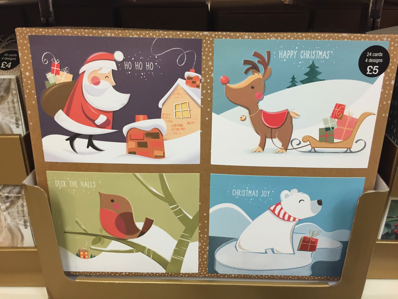
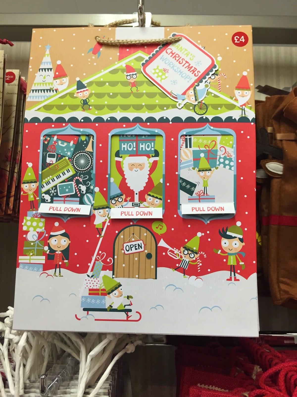
Laura and I went to M&S at Christmas time to take photos of the cards and gifts. We did this as inspiration for our Christmas card.


I found this research very helpful as it lead us to some interesting ideas we might not have thought of without seeing other cards. 

OUGD603: Extended Practice - Brief 5 Initial Planning

Laura and I knew that we wanted the taster day to be interactive so we started planning. 


We did't have a lot of time to come up with a concept so we chose to use the artwork from the christmas card and design an advent calendar with a typographic theme. We believe that this concept best demonstrates the first year of the course and also gives students a head start in the summer brief.

OUGD603: Extended Practice - Brief 5 (Interactive Taster Day Idea Development)

Laura and I are planning to carry out an interactive taster day with the FE students. We hope to give them some insight into the Graphic Design course and also teach them the basics of Graphic Design before they embark on the course.

To start this brief we looked at some lesson plans that are already out their for Graphic Design students. 


Typography seems to be the most popular lesson plan on the internet with a lot of the results showing up in this area.


Key information:


FONTS


TYPEFACE ELEMENTS: bold, underline and Italic
The term 'Font' was originally used to identify the design elements in a typeface e.g. bold, underlined, or italic.
Bold type can add an emphasis or strength to a font.
Underlined type is an effective way of emphasizing the title of a document. It can also be used to call attention to an important section of text.
Italic type can also emphasise an important word or passage of text, but it tends to be used in a more informal context. Italic fonts have an animated style and are often selected for designs where there is a need to convey the illusion of speed and energy.

TYPEFACES


FONT FAMILY: Century
The term 'Typeface' was originally used to identify a family of fonts.
'Century' is a typeface. The fonts above are all members of the 'Century' family. Their height is measured in points - the standard unit for printed text. There are about 72 points to one inch.
Although the above fonts are all the same height, note how their breadth varies according to their style. Some fonts are more suited to fitting into a confined area of a design, while others like to spread themselves out.
Serif and Sans Serif
There are two main font types: serif and sans-serif.
Serifs are the extended corners at the ends of a letter and like all good design, they evolved naturally. They originated in the stone-carved letters of the Ancient Romans. Stone masons discovered that it was technically easier to finish chiseling the ends of a letter in a slow curve. Not only did serifs look more elegant but they were also very practical as they formed a natural channel for water or rain to flow away as it cleaned dust from the corners.
Serif fonts are the most legible and are commonly used for large blocks of text. Their wide horizontal baseline emphasises the line of text for the eye and makes reading more comfortable.
Sans-serif fonts are simply fonts without serifs ('sans' means 'without' in French). They are also sometimes called Gothic fonts.


OUGD603: Extended Practice - Brief 9 LCA Xmas Card

The marketing department sent out an email asking for a christmas card design for members of staff to send out to suppliers, artists etc. The brief is as follows:


I placed the brief into a 603 brief template:


I am very excited about this brief because it is not something I would usually go for. I am becoming more interested in digital design but I think that I should still practice print design. 

OUGD603: Extended Practice - Design Something More Briefing

Today we had a visit from Design Something More or Something More, a new design studio based in Leeds. Jon, Stephen and Simon all came from Elmwood a global branding agency in Leeds. Their methodology is to make sure that all brands are a wonderful experience. At the start of their presentation they showed us a short video which was put together by Hungry Sandwich Co. (previous LCA students). I found this video a really interesting way to present themselves as a brand. I also liked the level of collaboration that they showed by using Hungry Sandwich to help them brand themselves. Though they didn't have any work to show us I was still very impressed with their presentation and overall attitude.


Jon and Stephen briefed us the Ministry of Wonderful, which is basically making brands a wonderful experience. 


We were each given a brand/company which generally has a bad experience. I was given Train Operator. 


Copyright 2010. All rights reserved.

RSS Feed. This blog is proudly powered by Blogger and uses Modern Clix, a theme by Rodrigo Galindez. Modern Clix blogger template by Introblogger.